Building Mystery and Exclusivity: Brand Identity Without Product Visibility
Defining brand personality and creating distinctive visual identity for a Berlin urban farming innovator serving Michelin-star chefs—while keeping their entire product catalog secret.
Berlin
Urban Farming Hub
Michelin
Star Chef Clientele
MVB
Minimum Viable Brand
Zero
Products Shown Online
01 | Client & Context
When Secrecy Becomes Strategy: Branding the Invisible
A Berlin-based urban farming company produces rare, customized botanicals for Michelin-star chefs and high-end culinary professionals—but their competitive advantage requires keeping their entire product catalog secret. How do you build a compelling brand identity when you can't show what you sell?
The client:
An urban farming innovator in Berlin, Germany, specializing in producing rare, customized botanicals for top-tier culinary professionals including Michelin-star chefs and exclusive restaurants. Their business model centers on bespoke cultivation—growing specific varieties tailored to individual chef requirements.
The context:
The company operates in a unique niche where product secrecy provides competitive advantage. They don't display their product catalog online or in any public-facing materials, both to maintain exclusivity and to protect their proprietary cultivation methods and rare botanical varieties from larger competitors.
The challenge:
Create a brand identity that communicates innovation, exclusivity, and high-end positioning without being able to show actual products. Differentiate from large agricultural competitors while avoiding typical "startup" aesthetics that might undermine credibility with established culinary professionals.
Why adriane.studio:
This required someone who could build brand identity through atmosphere and suggestion rather than product photography, understand the intersection of culinary culture and agricultural innovation, balance exclusivity with approachability in brand personality, and develop visual strategies that maintain intrigue while building trust.

02 | The Challenge
Invisible Products, Visible Identity
Gallery: Website mockups and brand elements


Click any image to view in lightbox
The Secrecy Constraint
The company deliberately doesn't display products online to keep their catalog secret and emphasize customized offerings. This meant the brand identity couldn't rely on product photography, catalog layouts, or any visual strategies that depend on showing what you sell—eliminating the most common brand-building tools.
Differentiation Imperative
The company needed to stand apart from large agricultural and food technology competitors with established market presence and significant resources. The brand had to signal innovation and quality without the typical "disruptive startup" aesthetics that can seem immature or unreliable to conservative culinary professionals.
Audience Sophistication
Michelin-star chefs and high-end culinary professionals have extremely refined aesthetic sensibilities and low tolerance for anything that feels inauthentic, over-marketed, or generic. The brand needed to speak their language—compelling but never hyperbolic, exclusive but never pretentious.
Exclusivity Without Elitism
The brand needed to convey exclusivity and premium positioning while remaining approachable and down-to-earth. Too commercial and it loses credibility with artisan chefs; too exclusive and it becomes alienating. Finding the right tone required nuanced understanding of culinary culture.
03 | The Approach
Minimum Viable Brand: Iterative Identity Building
Rather than developing comprehensive brand guidelines upfront, I employed a Minimum Viable Brand (MVB) strategy—starting with essential elements and iterating based on client feedback and market insights as the brand evolved.

Brand Personality Definition
Conducted workshops and strategy sessions to define the company's brand personality. Explored how they wanted to be perceived by culinary professionals, what made them unique in the urban farming space, and how to articulate their customization philosophy.
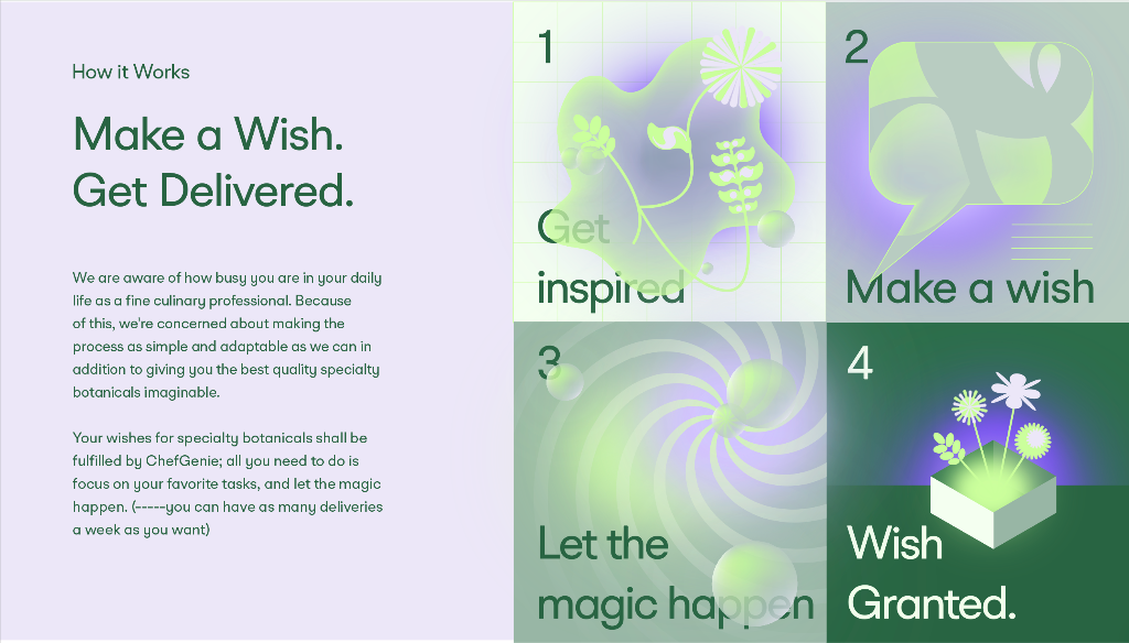
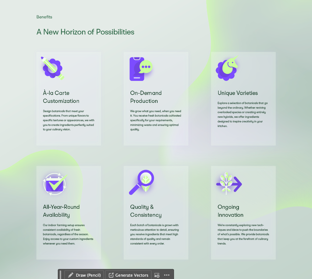
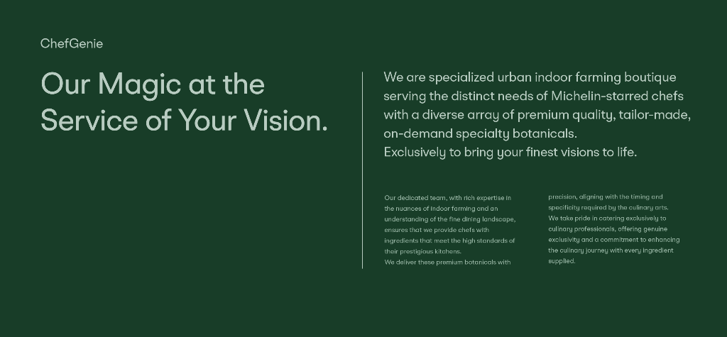
Visual Strategy Without Products
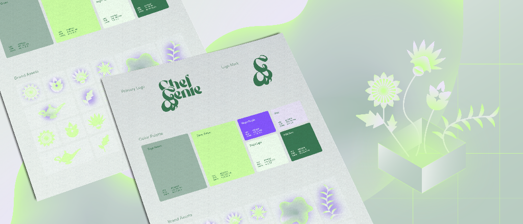
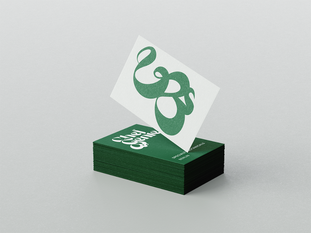
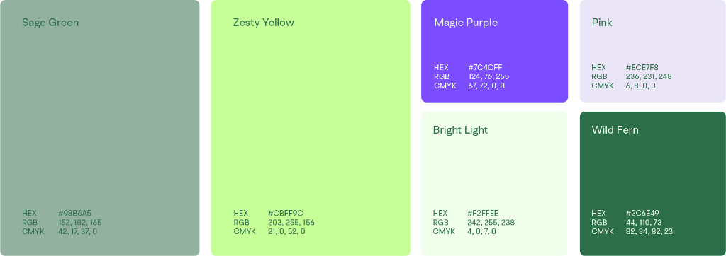
Developed a visual identity using illustrations and dreamy, atmospheric visuals instead of product photography. Created a clean, neat layout focusing on greens and purple to convey both botanical authenticity and a sense of magic and exclusivity.
Illustrative Language Development
Designed illustrative elements that could represent uniqueness and customization metaphorically—suggesting the rare and bespoke nature of the botanicals without revealing specific varieties or growing techniques.
Brand Asset Creation
Developed comprehensive brand assets including logos, color schemes, typography, and visual elements. Each component was designed to work cohesively while maintaining flexibility for future evolution.
Website Design and Development
Built a website featuring the illustrative and dreamy visual style, ensuring it was user-friendly and aligned with the brand's exclusive image. The site communicates values without showcasing actual products.
Iterative Refinement Framework
Established processes for continuous improvement and alignment with market feedback. Rather than treating brand identity as a fixed deliverable, created a living system that could evolve with the company.
04 | Brand Development Process
From Workshops to Visual Identity


1 / 4
05 | Results & Impact
Distinctive Identity, Market Validation
Distinctive Differentiation
Successfully established a brand identity that clearly differentiates the company from large agricultural and food technology competitors. The illustrative, dreamy aesthetic stands apart from generic corporate branding while maintaining professional credibility.
Exclusivity Without Product Display
Created a cohesive visual identity that uses illustrations and atmospheric visuals to represent uniqueness and customization without revealing actual products. Proved that secrecy and strong brand presence can coexist effectively.
Audience Alignment Validation
Received positive feedback from initial market tests and client consultations, indicating strong alignment with target audience expectations. Culinary professionals responded to the brand's balance of exclusivity and approachability.
Avoided Startup Clichés
Successfully positioned the brand as established and credible rather than using typical startup aesthetics. The visual approach signals innovation and craft without the "disruptive tech" tropes that can undermine trust with traditional culinary professionals.
Compelling Yet Grounded Messaging
Developed brand messaging that appeals to high-end culinary professionals without appearing overly commercial or hyperbolic. Found the precise tone that conveys premium positioning while remaining down-to-earth and craft-focused.
Flexible Brand Framework
The MVB approach created a brand system that allows for continuous improvement and evolution. Rather than being locked into comprehensive guidelines, the company can refine and adapt their identity based on ongoing market feedback.
Website as Brand Experience
Built a website that effectively communicates brand values and the customization approach without showcasing actual products. The site maintains the secretive and exclusive nature while providing enough information to engage potential clients.
06 | Core Capabilities Demonstrated
Brand Building Beyond Products
Atmospheric Brand Identity
The ability to create compelling brand presence through mood, illustration, and visual metaphor rather than relying on product photography. Building identity through suggestion and atmosphere when traditional brand-building tools aren't available.
Minimum Viable Brand Methodology
Employing iterative, lean approaches to brand development. Starting with essential elements and refining based on real market feedback rather than attempting to define comprehensive guidelines upfront.
Audience Cultural Intelligence
Deep understanding of culinary professional culture, aesthetic sensibilities, and communication preferences. Knowing how to speak to sophisticated audiences without condescension, how to convey exclusivity without elitism.
Differentiation Strategy
Positioning brands against larger, established competitors through distinctive visual language and personality rather than feature comparisons or pricing. Creating identity that feels unique and memorable.
Strategic Secrecy Management
Understanding how to build brand identity and marketing presence for companies whose competitive advantage requires product secrecy. Using constraints as creative opportunities rather than limitations.
Visual System Development
Creating cohesive visual identities including logos, color palettes, typography, illustrative elements, and layout principles. Developing brand assets that work across digital and physical touchpoints.
07 | Key Learnings
Insights on Exclusive Brand Development
Balancing Exclusivity and Clarity
The importance of balancing exclusivity with clear, compelling messaging in branding high-end products cannot be overstated. Exclusivity creates desirability, but it must be paired with enough clarity that potential clients understand the value proposition and feel invited to engage.
Illustration as Strategic Tool
The effectiveness of using illustrations and dreamy visuals to maintain product secrecy while still creating an attractive brand image exceeded expectations. When you can't show products, illustrations become not just decoration but core brand strategy.
MVB Enables Market Learning
The value of an iterative Minimum Viable Brand approach in adapting to market feedback and refining brand strategy proved essential. Rather than committing to comprehensive brand guidelines that might miss the mark, starting lean allows real market insights to shape brand evolution.
Constraints Drive Creativity
Product secrecy felt like a constraint but became a creative opportunity. Not being able to show products forced more imaginative, atmospheric brand building that ultimately made the identity more distinctive and memorable.
Visual Palette Conveys Positioning
The strategic choice of greens and purple to convey both botanical authenticity and magical exclusivity demonstrated how color palettes communicate brand positioning as powerfully as words. Visual decisions aren't just aesthetic—they're strategic statements.
Need Brand Identity for Exclusive or Confidential Products?
If your company requires building strong brand presence while maintaining product secrecy, differentiation from larger competitors, or positioning for sophisticated professional audiences, let's explore how strategic brand identity can work for you.
Start a Conversation